Explorer
Explorer
Article Summary
Share feedback
Thanks for sharing your feedback!
Do you have the right Plan?
Explorer reporting is only available on the Business plan.
Explorer is a data exploration tool to help you visualize your data, in graph form, in hundreds of new and useful ways. Explorer is only available currently in the Business plan of Close.
It lets you quickly create line graphs and bar charts based on whichever parts of your sales data you care about. You choose a metric for the vertical y-axis, a field for the horizontal x-axis, and any applicable filters, and we'll bring you a graph in seconds.
You'll notice a few different dropdowns/filters in Explorer - they determine what you get back in the graph.
- The first big dropdown controls the y-axis.
- The second big dropdown controls the x-axis.
- The third big dropdown (if available) plots multiple lines on the chart, by this dimension.
- The smaller dropdown below the first large one (if available), represents a filter of the objects in the y-axis dropdown.
- A date picker will appear if the x-axis dropdown is a date field.
- An average/min/max/total dropdown will appear for some options. This allows you to choose which function is applied to value in each interval.
Close Product Help: Only Certain Custom Fields are Visible in Explorer
In the first (y-axis) dropdown, only Custom Fields that have numeric values will appear.
In the second (x-axis) big dropdown, all your Custom Fields should be valid options, except for Text Custom Fields and Choice Custom Fields with more than 10 choices. The limit of 10 exists currently because our interface can't support a large number of columns. The API does allow for any Custom Field to be a valid "x" option.
Number of data points with Date x-axis
If you select x-axis to be your Date axis, Close will automatically change the number of data points based on the selected date range:
- 3 days or less - hourly view
- 3-60 days - daily view
- 60-366 days - weekly view
- 366-1000 days - monthly view
- 1000+ days - quarterly view
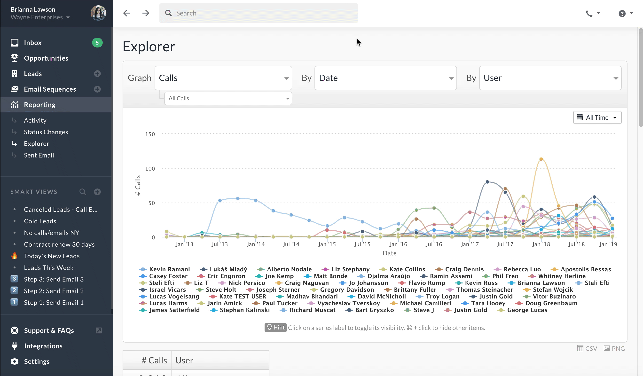
Toggling Multiple Series Lines
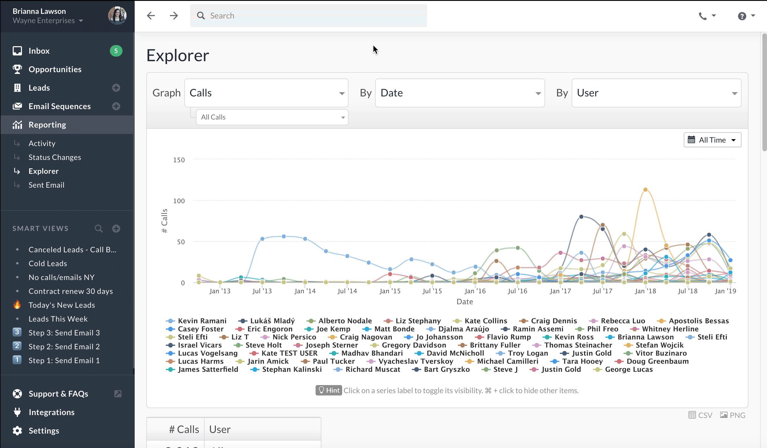
A common way to use Explorer is to compare performance of different sales reps over time. For example, here you can see the number of Calls made by each User over time.
Here are some tips for narrowing down which lines are shown:
- Click on a series name (e.g. "Liz Stephany") to toggle the visibility of that particular series.
- Cmd-Click (Mac) or Ctrl-Click (Windows) on a series name (e.g. "Liz Stephany") to show only that series and hide all others.
Example Reports
- Show me a breakdown of my leads by a specific text custom field (e.g. Industry).
- What % of my leads have a specific numerical custom field value (e.g. Score)?
- Show me a line graph of how many leads have a certain date custom field value (e.g. Contract Ends Date).
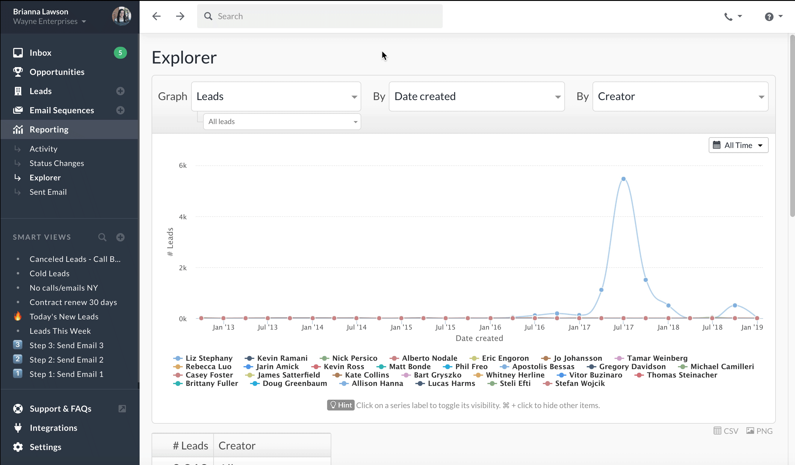
- Show me how many of my leads were created by each teammate. Example below:
- Show me when leads in a specific Smart View were created (how many per week/month).
- How many points of contact do we have per company, on average?
- Show me the breakdown of all my leads bucketed by how many times I've communicated with them.
- For a specific lead status, show me how long ago our latest communication was with those leads.
- How many of our leads still need phone numbers or an address added to them?
- Show a breakdown of leads created manually, by API, or by email.
- Do we communicate, on average, more with certain types of customers/leads than others?
Opportunity Reports
- Show me a graph of $ in closed deals, over time, by user.
- Show me how many opportunities were created by each sales person, over time.
- Show me how many total active/won/lost opportunities each teammate created. Example below:
- Show opportunities broken out in buckets of their deal size.
- Show me a graph of how many opportunities were won over time, and when.
- Show me how many leads have more than one Active opportunity.
Call Duration Reports
- Are we making more minutes in sales calls per day/week/month than we used to?
- How do our incoming call's vs. outgoing call's durations compare?
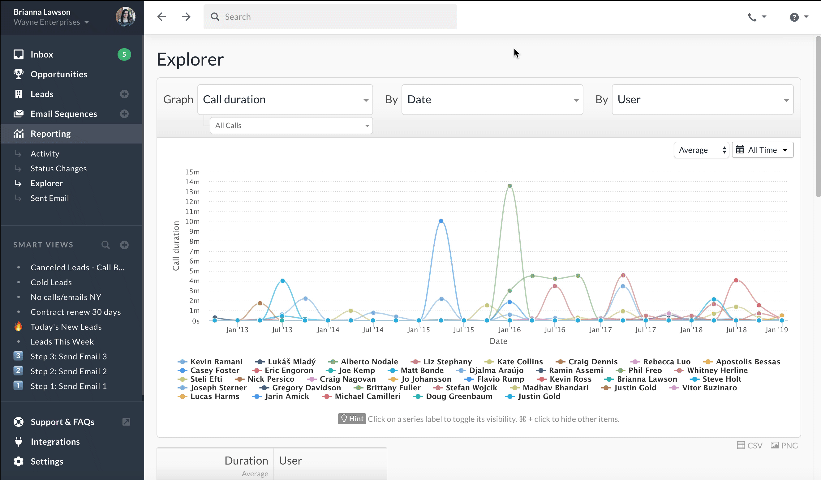
- Show me the average call duration, per sales person, over time. Example below:
- Are our sales calls longer, on average, at certain times in a day?
- Have our sales calls gotten longer or shorter over time?
- What percentage of our calls are over 1 minute in length?
- Are calls to leads in one Smart View longer or shorter than calls made to another?
Call Number Reports
- Are we making more calls per day/week/month than we used to?
- Show me how the number of calls compares between sales people. Example below:
- For leads in a specific Smart View, show me how many calls were made over time, and by whom.
- Are the number of calls over 1 minute in length higher on certain days of the week?
- Do we make more calls with our current customers, or with prospects?
- What percentage of our leads have never been called? Called more than once?
Email Reports
- How many emails were sent, over time, by person?
- Which % of my emails are opened? Opened more than once?
- Show me how many emails from a specific Smart View were replied to.
- Which email templates are our team using most often? Example below: